
7 Mistakes You're Making with Your Home Service Website (and How to Fix Them)
- kentarian30
- 3 days ago
- 5 min read
Look, let's be real here. Your website isn't doing you any favors if it's driving potential customers away before they even pick up the phone. As someone who's helped countless home service businesses get their digital act together, I see the same mistakes over and over again.
The good news? These mistakes are totally fixable. And once you fix them, you'll start seeing more calls, more leads, and more business. Let's dive into the seven biggest website mistakes that are probably costing you customers right now.
Mistake #1: Your Site Looks Like Garbage on Mobile
Here's a wake-up call: over 60% of your potential customers are looking at your website on their phones. If your site doesn't work perfectly on mobile, you're basically telling more than half your audience to go find someone else.
I've seen plumbing websites where you need to zoom in just to read the phone number. HVAC sites where the "Get Quote" button is completely hidden off-screen. It's painful to watch, and it's costing you serious money.
How to Fix It: Start with mobile-first design. This means building your site for phones first, then making it work on bigger screens. Test your site on different devices - your phone, your tablet, maybe even borrow your kid's phone. Make sure everything works smoothly, buttons are easy to tap, and text is readable without squinting.
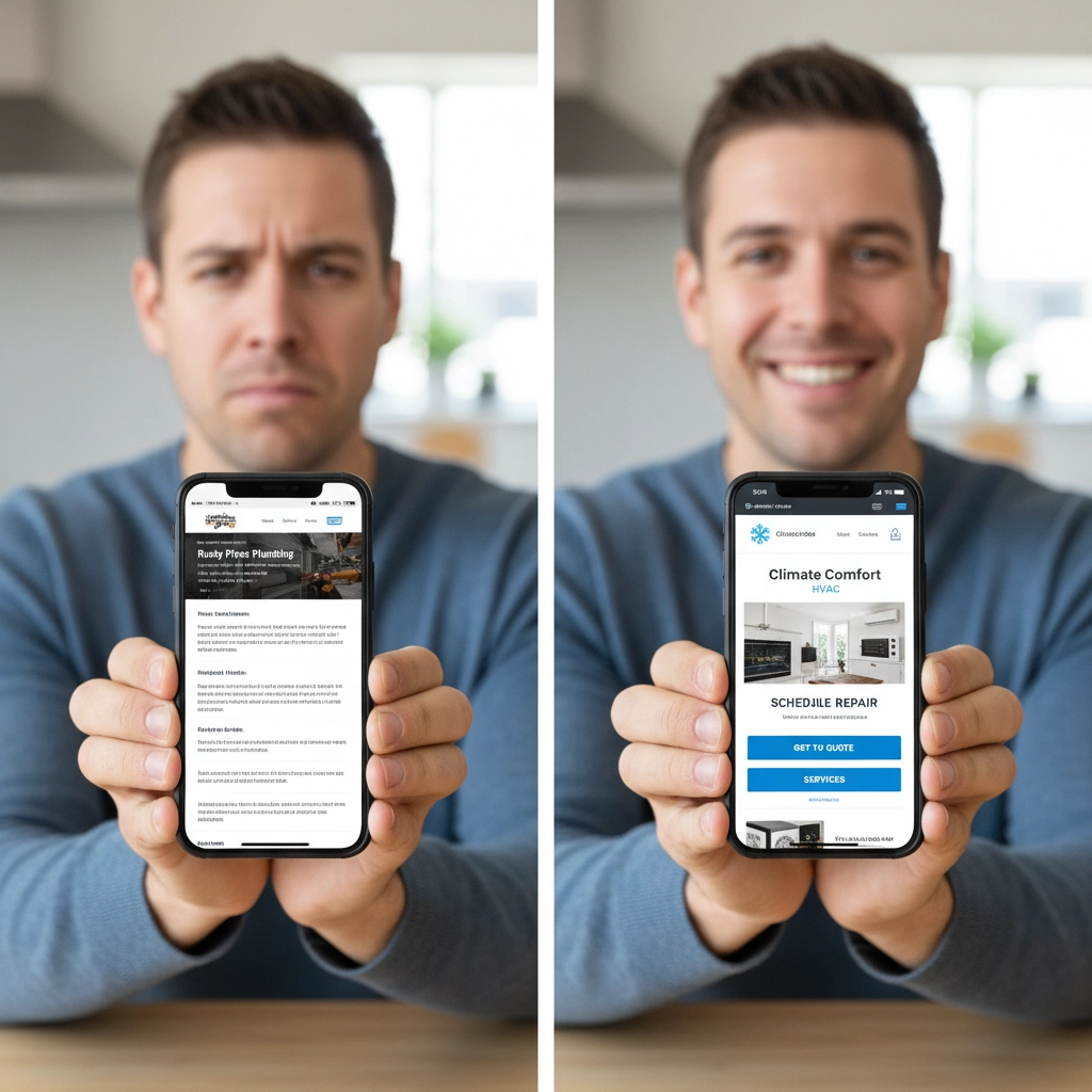
Mistake #2: Your Call-to-Action is Invisible (or Nonexistent)
You know what drives me crazy? Visiting a home service website and having to hunt around for 10 minutes just to figure out how to contact them. Your visitors shouldn't need a treasure map to find your phone number or request a quote.
If your call-to-action button blends into your background, uses tiny text, or is buried at the bottom of the page, you're making it way too hard for people to become customers.
How to Fix It: Make your phone number huge and clickable. Put a bright, contrasting "Get Free Estimate" button at the top of every page. Use action words like "Call Now," "Schedule Today," or "Get Your Quote." And for the love of all that's holy, make sure your contact info is in your header and footer on every single page.
Mistake #3: Your Homepage is a Wall of Text
Nobody - and I mean nobody - wants to read your entire life story when they just need their toilet fixed. Yet so many home service websites dump paragraphs and paragraphs of text on their homepage like they're writing a novel.
Your visitors are busy people with problems that need solving. They want to know three things: what you do, if you serve their area, and how to contact you. That's it.
How to Fix It: Keep it simple. Use bullet points instead of paragraphs. Break up text with headers and white space. Lead with what matters most - your services, your service area, and your contact info. Save the detailed explanations for dedicated service pages.
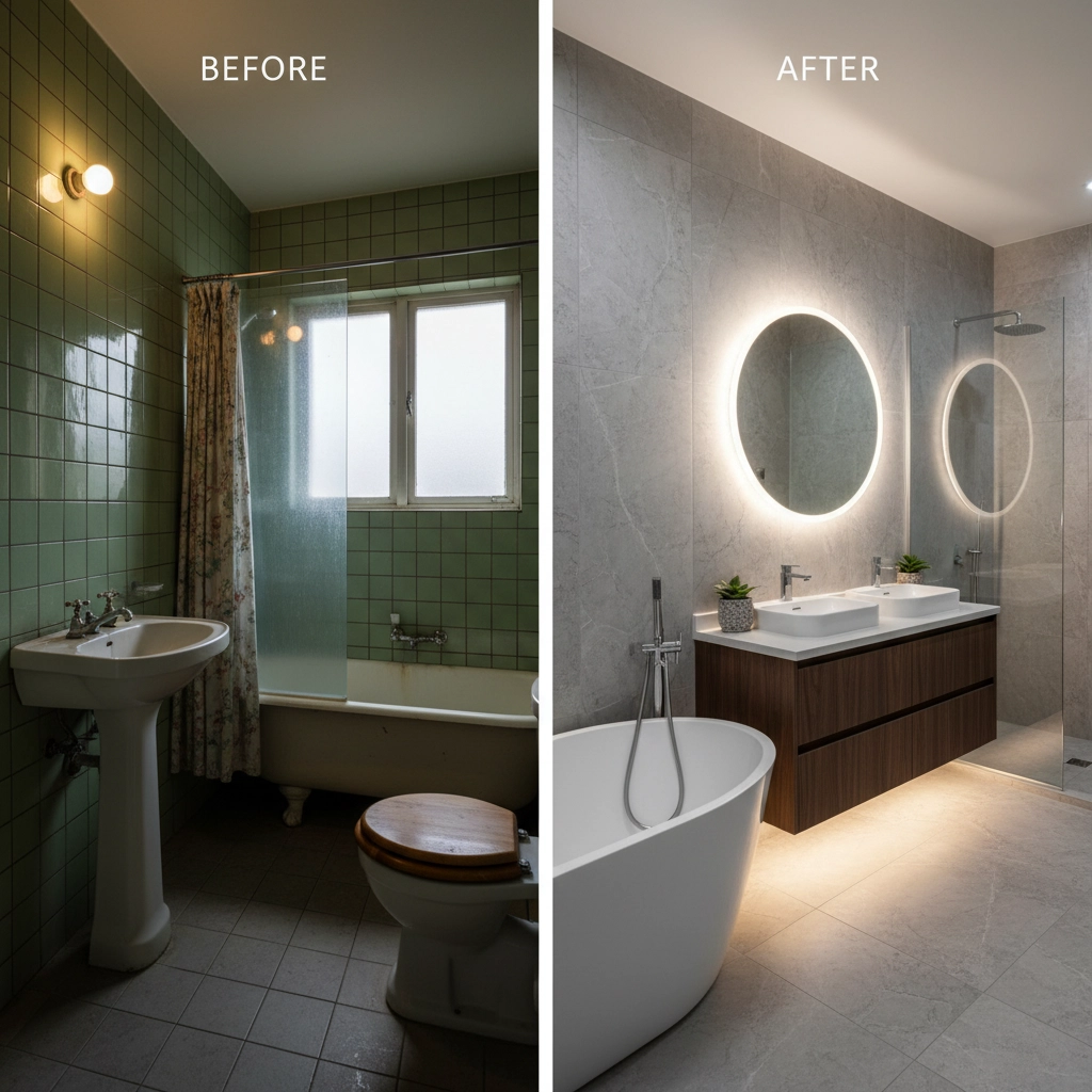
Mistake #4: Your Photos Look Like They Were Taken with a Potato
Blurry, dark, pixelated photos scream "amateur hour." When someone is thinking about letting you into their home or trusting you with an expensive repair, professional photos aren't just nice to have - they're essential.
I've seen roofing websites with photos so blurry you can't even tell what kind of roof it is. Landscaping sites with photos that look like they were taken during an earthquake. This stuff matters more than you think.
How to Fix It: Invest in decent photography. You don't need to hire a professional photographer for every shot, but you do need clear, well-lit photos of your work. Take before-and-after shots of your projects. Show your team in action. Make sure all photos are high resolution but optimized for web so they don't slow down your site.
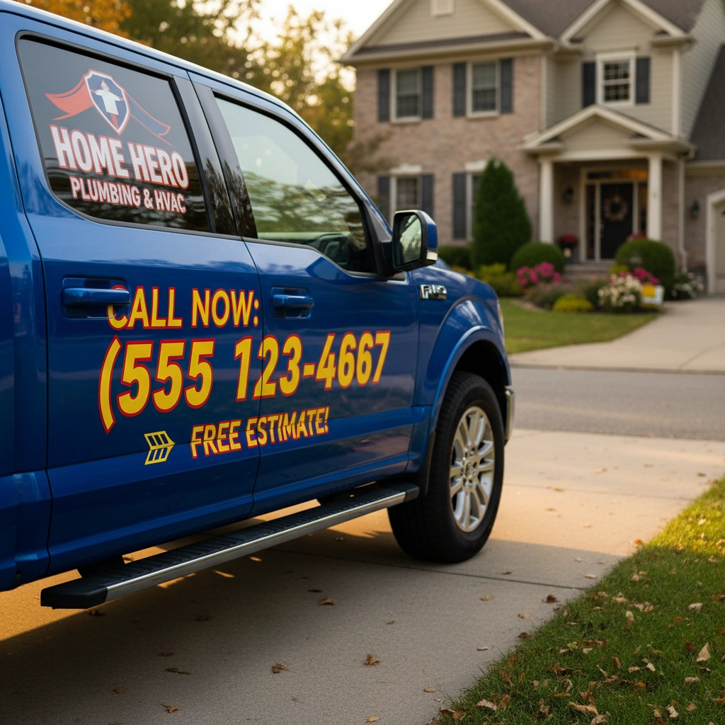
Mistake #5: Playing Hide and Seek with Your Contact Info
This one blows my mind every time. I'll visit a contractor's website, and finding their phone number is like solving a puzzle. It's in tiny text in the footer, or buried on a separate "Contact" page, or missing entirely from half the pages on the site.
Your contact information should be the easiest thing to find on your entire website. Period.
How to Fix It: Put your phone number in big, bold text at the top of every page. Make it clickable on mobile. Include your service areas prominently - don't make people guess if you work in their city. Add your address and hours of operation. The easier you make it to contact you, the more contacts you'll get.
Mistake #6: Zero Social Proof
Here's the thing about home service customers - they're cautious. They're letting strangers into their homes and trusting them with expensive repairs or improvements. Without reviews, testimonials, or examples of your work, you look like a risk they're not willing to take.
How to Fix It: Start collecting testimonials from every happy customer. Ask for reviews on Google and other platforms. Display customer reviews prominently on your homepage. Create case studies with before-and-after photos. Show off certifications and licenses. The more social proof you have, the more trustworthy you appear.
Mistake #7: Your Site Loads Slower Than Dial-Up Internet
In today's world, waiting for a website to load is like watching paint dry. If your site takes more than 3 seconds to load, people will bounce faster than a rubber ball. And Google? They hate slow websites too, which means you'll rank lower in search results.
Common culprits include massive image files, too many plugins, and cheap hosting that can't handle traffic.
How to Fix It: Compress your images before uploading them. Choose quality hosting - yes, it costs a bit more, but it's worth it. Remove unnecessary plugins and features. Test your site speed regularly with tools like Google PageSpeed Insights and fix any issues that come up.
The Bottom Line
These mistakes aren't just annoying - they're costing you real money. Every visitor who can't figure out how to contact you, every mobile user who can't navigate your site, every potential customer who bounces because your site takes forever to load - that's revenue walking out the door.
The good news is that these fixes aren't rocket science. Most of them can be addressed with some basic updates and a focus on user experience. Your website should work for your business, not against it.
Ready to turn your website into a lead-generating machine? Stop letting these common mistakes sabotage your online presence. Your competition is probably making the same errors, which means fixing them gives you a real competitive advantage.
Want to see how your website stacks up and get a personalized action plan for improvement? Check out our website audit tool at thrive-bridge.com and let's get your digital presence working as hard as you do.
Remember, in the home service business, your website is often the first impression you make. Make it count.
Comments